A visual field guide from Bauhaus to today. Learn what each approach values, what it reacts to, and how to use it with intention.
History is a conversation, not a straight line.
These are selected, overlapping movements in a largely European and North American graphic-design history—not a complete global survey. “Modernist” names a historical outlook; it does not simply mean “current.” Today, ordered systems and expressive reactions coexist.
The images are original teaching studies, not historical artifacts. Follow the museum and research links for original works and deeper context.
10 DESIGN DIRECTIONS / CHRONOLOGICAL ORDER
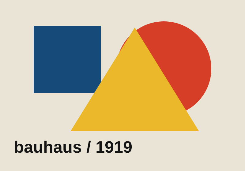
Original teaching illustration · Bauhaus
1919–1933 / Modernist foundations
Bauhaus
Art, craft, and industry share a workshop.
The German school joined artistic experiments with practical making. Geometry, typography, and material studies became tools for rethinking everyday life. It was a diverse school, not a single primary-color recipe.
Geometric forms · economical type · asymmetry
What it responds to
Challenged the separation between fine art and useful objects, and helped shape modern design education.
Try it in your portfolio
Build a project identity with three reusable shapes. Let each shape perform a consistent job.
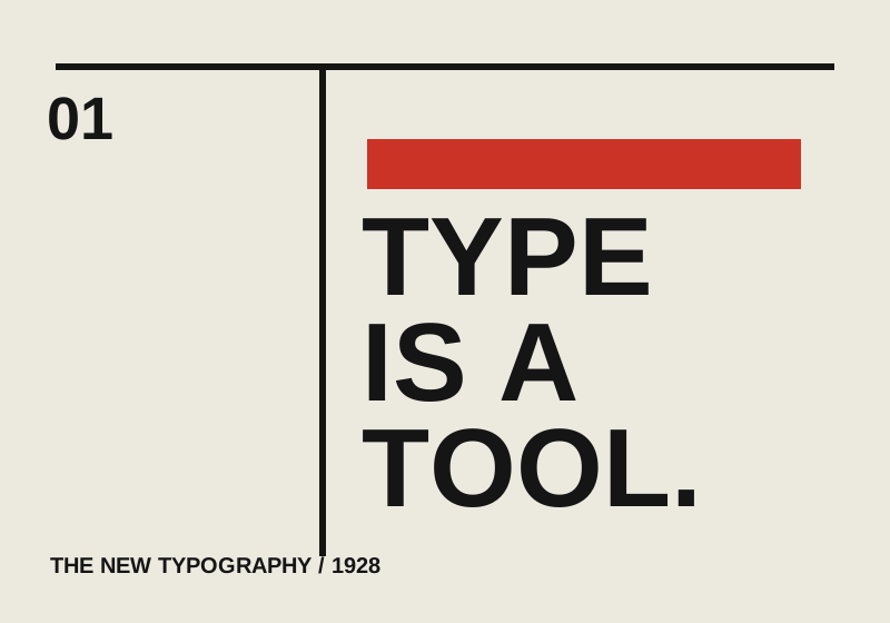
Original teaching illustration · The New Typography
1920s–1930s / Modernist foundations
The New Typography
Arrange information for a new industrial age.
Jan Tschichold codified ideas from the European avant-garde in 1928. Asymmetric layouts, sans-serif type, and purposeful white space challenged the centered conventions of earlier commercial printing.
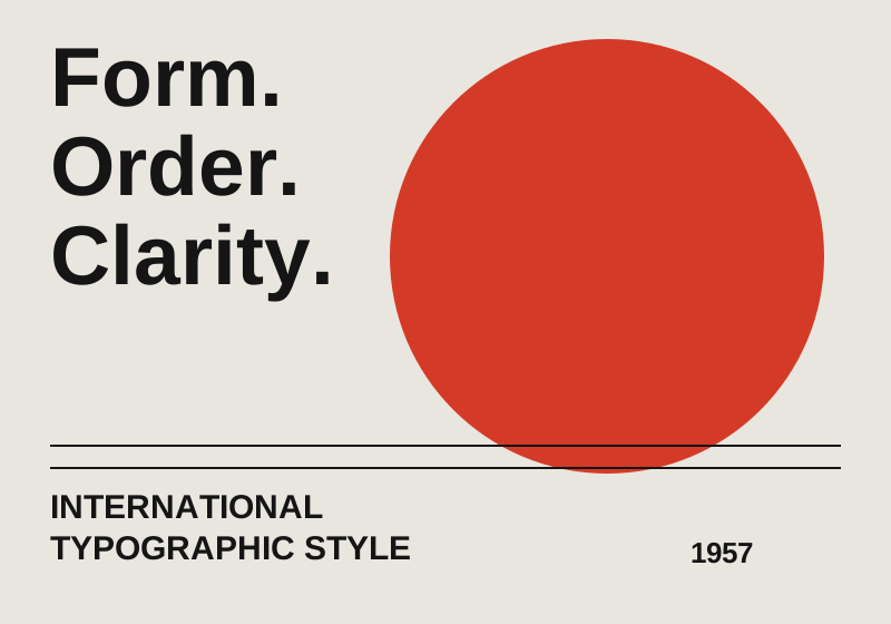
Swiss graphic designers developed systematic grids, clear sans-serif hierarchies, and disciplined image placement. Josef Müller-Brockmann and Armin Hofmann are key references. These principles still inform editorial and interface systems.
Modular grid · flush-left type · restrained palette
What it responds to
Extends modernist clarity. Later designers questioned whether neutrality can erase cultural context or individual expression.
Try it in your portfolio
Align project titles, captions, and images to the same columns. Use one accent to mark the most important action.
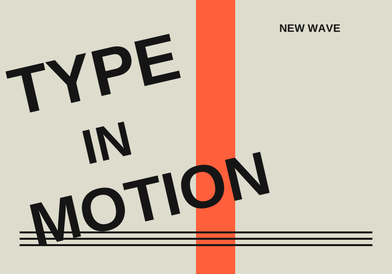
Original teaching illustration · New Wave / Swiss Punk
Late 1960s–1980s / Reactions & experiments
New Wave / Swiss Punk
Learn the grid, then put it under pressure.
Wolfgang Weingart explored expanded spacing, layered printing, and disrupted hierarchies within Swiss typography. New Wave made the act of arranging type visible. Swiss Punk is a typographic label, not simply a synonym for punk concert graphics.
Layered type · shifting baselines · unexpected scale
What it responds to
An internal challenge to strict Swiss conventions, showing that typographic expression can carry meaning.
Try it in your portfolio
Break alignment once in a project cover; preserve predictable reading order in the case study.
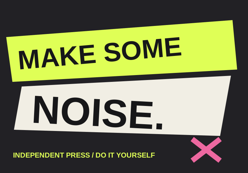
Music scenes and independent publications used low-cost reproduction, collage, and urgent lettering. The roughness could signal independence from professional polish. Different scenes developed different looks; there was no single punk rulebook.
Cut-and-paste lettering · stark contrast · irregular edges
What it responds to
Challenges institutional taste and polished commercial communication through accessible tools and subcultural expression.
Try it in your portfolio
Give your cover an assembled quality, but keep navigation and body copy readable.
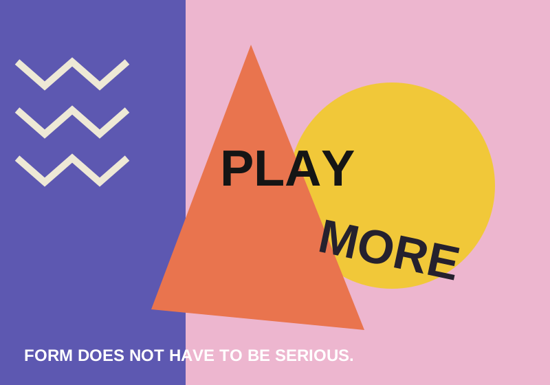
Original teaching illustration · Postmodern / Memphis
1970s–1990s; Memphis from 1981 / Reactions & experiments
Postmodern / Memphis
Meaning can be playful, contradictory, and plural.
Postmodern designers mixed historical references, ornament, irony, and popular culture. Memphis is one influential strand, recognizable for its lively geometry and patterns. It does not represent all postmodern design.
Pattern · clashing geometry · playful references
What it responds to
Rejects the idea of one universal, purely functional visual language. Context and interpretation become part of the design.
Try it in your portfolio
Use an unexpected pattern to express a project’s personality; test that it does not compete with the content.
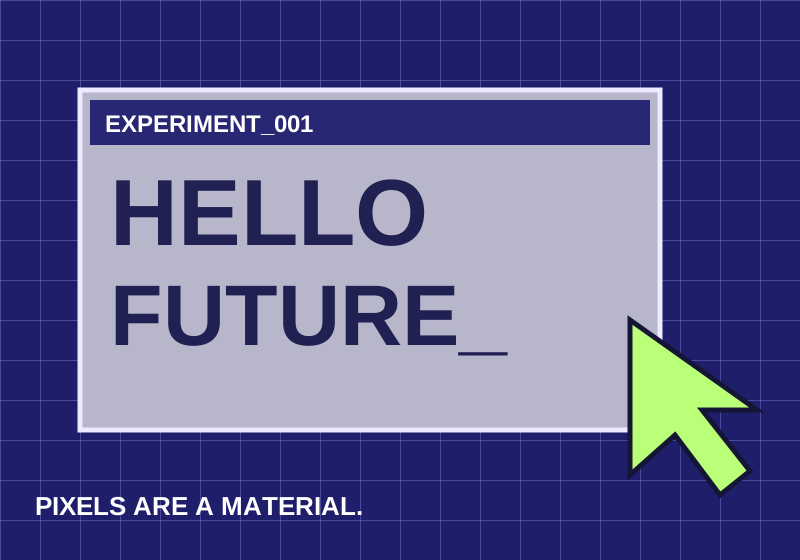
Original teaching illustration · Digital experimentation
1980s–2000s / Reactions & experiments
Digital experimentation
The screen becomes a new material.
Desktop publishing expanded what designers could do with type and layering. Pixel-based letterforms and experimental digital typography made technological constraints expressive. This period contains many approaches, rather than one unified style.
Pixel forms · layered text · unconventional typography
What it responds to
Questions the smooth consistency of established print systems while exploring what new tools make possible.
Try it in your portfolio
Use a pixel motif for a coding experiment, paired with a comfortable body font for the explanation.
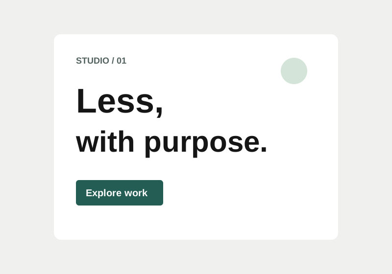
Original teaching illustration · Digital minimalism / Flat UI
2010s onward / Contemporary directions
Digital minimalism / Flat UI
Reduce visual noise. Preserve useful signals.
Flat interfaces reduced imitation materials and decorative depth in favor of typography, spacing, and simple shapes. Minimal presentation can focus attention, but removing too many cues makes interactive elements harder to recognize.
Open space · simple surfaces · clear hierarchy
What it responds to
Renews modernist reduction in response to visually elaborate interfaces. Usability requires visible affordances, not just fewer pixels.
Try it in your portfolio
Keep case studies focused, and make every link and button recognizable without hovering.
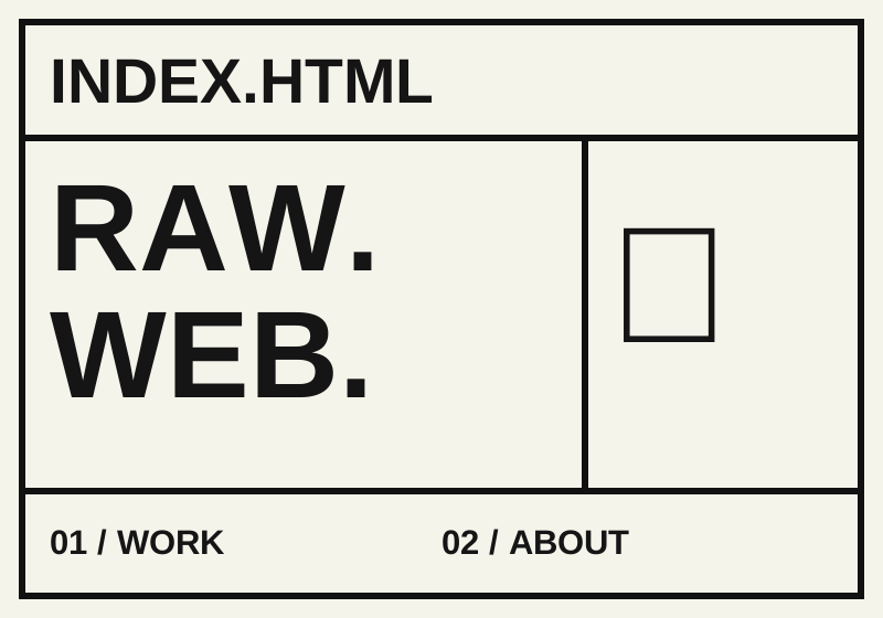
Web brutalism often favors raw typography, visible structure, and direct links. Some examples resemble bare HTML. The term borrows an architectural metaphor; it is not the same movement as twentieth-century architectural Brutalism.
Blunt typography · exposed structure · direct links
What it responds to
Pushes back against polished, interchangeable websites. Anti-design may add deliberate friction, but that is not required for brutalism.
Try it in your portfolio
Use strong borders and direct labels. Keep semantic HTML, keyboard access, and readable text intact.
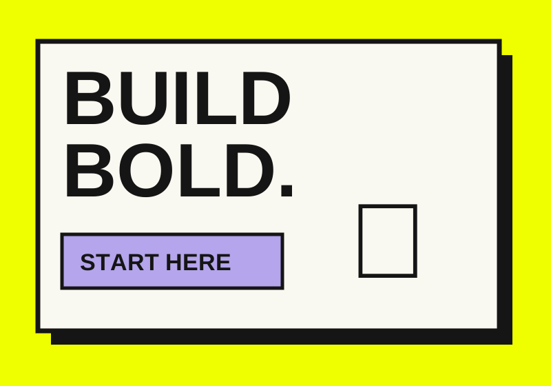
Bold borders, saturated accents, and often hard shadows give familiar interface components an assertive personality. Our default starter is a restrained brutalist-inspired interpretation, close to this contemporary family.
Design the same project cover twice: once with Swiss order, once with New Wave disruption. Keep the words and images constant. Ask a classmate what they notice first, what they understand, and which version fits your audience.